Out of Your Head Project
1.1 Initial Ideas
The most challenging segment of the project was finalising a storyline that we feel we could all be passionate about and relate to on some level. We initially created a mind map of overarching themes that we would each like to inquire into such was youth and feelings related to liberation. We experimented with the idea of adults struggling to preserve their youthful imagination (refer to the first storyboard) as we have this fear oof losing that creative characteristic that kids are brimming with. We found that this did not resonate with all group members to the extent that we wanted it to. Hence, we explored themes of power and the greed that is associated with that and the idea that these themes can instigate loneliness (refer to the second storyboard). We delved further into this and explored how loneliness can be alleviated by ones self as opposed to the reliance of someone else resolving this. While the idea was intriguing we found it was not ideal for the time frame given. Finally, I presented an idea of a dad being challenged to draw outside the lines alluding to this idea that its okay to not always take life too seriously and make those mistakes. This acted as the foundation to our chosen idea of a girl spilling paint on her dads jacket in which she has a mental crisis about how her dads gong to react. Unexpectedly, the dad encourages the girl to paint a heart n his jacket that he wears to work the next day. The overall storyline is intended to appeal to the idea of not taking life to seriously and mistakes can be beautiful accidents, the outcome is not what you always expect. I am really excited to execute this storyline as I feel the message is very relevant to students nowadays in which some things may feel detrimental or the end of the world when in reality outcomes can be beautiful and lighthearted. I hope to encourage people that its okay to not be perfect and that a bad situation can be evolved into a good one depending on how you choose to approach it.
In terms of the collaboration atmosphere we got off on a rough start due to the overwhelming and conflicting ideas we had. But we reminded ourselves of the end goal of creating a meaningful and beautiful piece that we could be excited to create. We relied on trial and error and valued compromising as much as possible. Overall, I am looking forward to infusing our creative ideas to birth an authentic and diverse piece.
1.2 Storyboards
When formulating this storyline we considered various dynamic duos such as siblings, a mother and a daughter but found that a daughter- father dynamic induces a more heartwarming and wholesome tone/atmosphere. We initially considered having the daughter drop paint on important documents or go crazy over a simple mistake of painting outside the lines in which the dad actually ends up loving her work. However, we found this too predictable and conventional. While it still appealed to our idea of normalising and beautifying mistakes it didnt instigate a colossal shift in mood to resonate with the viewer. With the drawing being on a jacket this makes the storyline more unconventional in a subtle manner. With that said, Kwest and I both created our won storyboards to get an idea of the ways we could approach the animation in terms of composition and camera angles. Khalid then used these as a base to formulate a storyboard and animatic of his own. While we were fond of the final composition and camera angles used there was a lack of clarity in the animatic and the shots felt too rushed restricting the comprehension of the storyline. The animatic really opened our eyes to the how limited we are in timescale and encouraged us to recognise the pivotal/focal points of the story that aids in the clarity of the story and consequently assist us to recognise scenes that are not serving a vital role in the procession of the story.
1.3 Initial Character Designs
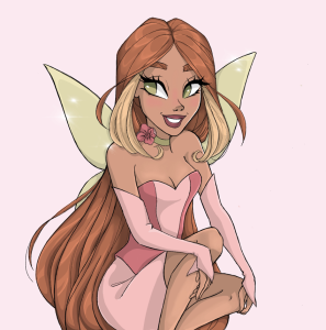
1.4 Daughter Character Designs
We ultimately wanted the characters to maintain a sense of simplicity to ensure we were all able to mimic it when animating whilst still imbedding some subtle details that wouldn’t overpower/overwhelm the animation but alternatively cohere/compliment the unconventionality of the storyline. We sustained the simplicity of the character by predominately relying on linear outlines and using a circle as the core geometric shape of her features, further giving the impression/characterising her as a soft, cute and approachable character similar to an actual child. We also considered texture and found the simplicity of her outline is balanced by the boiling the line of her afro like hair, inducing a subtle liveliness and playful element to her appliance, echoing the youthful persona we are trying to depict with her.
We considered various cool and soft toned based colour palettes but decided to take a monochromatic approach to appeal to this idea that their living in a very formal world where everything is linear (within the lines), appears overly/unrealistically polished and you’re not allowed to make a mistake. The black outline gives a graphic novel like appearance so still preserves that youthful playfulness. Additionally, we chose a pink tone to highlight the femininity of the character alongside, the vibrancy of a child. We also considered playing with the idea off changing the skin tone based on the emotional state she is in.
1.5 Dad Character Design
We wanted to induce that sense of divide/segregation between the characters to amplify the unexpected outcome. To achieve this we relied on square geometric shapes for the core of the dads features. The more sharp edges and lack of curves characterises the dad as more formal, strict and linear hence when he lets his daughter paint on the jacket its unexpected. The polarity of the characters is also shown through the colours. The blue tone is intended to create a more cold demeanour for the dad as though he has a short temper. We initially considered having a sketchy like unpolished outline for the characters but found this defeated the formality of the world and would force us to spoil the line of the characters detracting from the polished world they live in. Overall, I love the final outcome of the characters and how they don’t rely on their facial features to form their personality but alternatively their bodily shapes and colour palette.
1.6 Environment Designs
I took charge of the environment designs. We wanted to take a mixed media approach to attain that level of depth that can’t be encapsulated by solely relying on 2D animation. However to reduce the polarity and conflicting elements of the characters against the background I intend to render the 3D model into a graphic novel like appearance as seen in the moodboard above. I decided to go with the second sketch to model due to the more open landscape as opposed to a confined cube. While I am eager to begin modelling I am nervous to use Maya due to my limited experience. Nonetheless, I intend to resolve this by using an amalgamation of my existing basic knowledge and tutorials as well as tutor guidance.
I love the final outcome of the dining room. I used iatoon shader to create the graphic novel look with the contour render settings.
1.7 Developed Animatic (Final Stages of Pre-production)
Leave a Reply